|
|
|
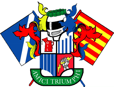
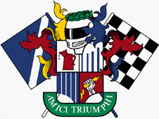
The Story Behind Our Coat of Arms, By: Greg Petrolati Joe Alexander and Jack Drews approached me at the ELVF several years ago. They wanted a logo for an internet forum based organization of Triumph folks... The "Friends of Triumph" would be a place where Triumph folks who race or compete with their TR's could get advice and information, coordinate meet-ups and events and get support when needed. The key thing was the FOT was a group of folks who hate "groups"... as I like to call it a "Disorganization". There would be no officers, no meetings, no real treasury or rules. In short, no pretensions. I puttered with a cartoon but it didn't really didn't seem right. While I was noodling on a drawing pad, the film "Caddyshack" was on the TV. It was the country club "Bushwood's" coat of arms that got the ball rolling for me. My thinking was "what would be cooler than a pretentious logo for a group with no pretensions?" Drawing on experiences I had while in the Society for Creative Anachronism (group of folks who recreate the middle ages). I started to lay out a design.
The old "Open Book" Triumph logo, which was supposed to represent the winged wyvern (kind of a dragon) of Coventry, was a natural for a "quartered device" (a shield divided into quarters). It would be the basis for a series of visual jokes that TR people and folks with British cars would readily recognize and appreciate. The lower right quarter is the gauntleted fist of the "Prince of Darkness" clutching a broken lightning bolt. The upper left quarter would be a leaking oil can. Coats of arms displayed often have a crest... a crown, hat or helmet that denotes the great person's rank or position. The FOT's focus is racing and competition. So, our crest is an enclosed racing helmet. On top of the helmet is a circle of victory laurels, an homage to the later Triumph logo. Next were the "supporters" (creatures or things on either side of the device) as a reference states, "Supporters originally represented as pages or squires. Later, these became animals or barbaric subjects representing his fierceness." For the FOT, symbols of our racing heritage gave me an opportunity for a couple more visual jokes. We may not be the fastest cars on the track. I used the "faster car approaching" blue flag with the diagonal white stripe on the left side. The Flag on the right came directly from a bumper sticker... "The parts falling off this car are of the finest British manufacture...". The debris on track flag of alternating yellow and red stripes took the right side. The motto "Amici Trumphi" came from a latin scholar friend of mine, finishing out the logo. When I presented the logo to Joe and Jack They loved it. The only change came from Jack (I think) who wanted the checkered flag because "sometimes we win". I made the changes and the "official" logo was approved. I had showed the original design around. It was Bill Dentinger who wanted large blazons for his trailer but he wanted the first design, which he used.
From there two iterations of the logo pop up depending on who produces them. I'm not sure what Joe or Jack's views of the two logos are. For me I think this is a perfect example of the FOT. It's a "disorganization"... everyone does their own thing, but is there (like the circus folk who come running when they hear "Hey Rube!") for whoever needs them.
|
|
|